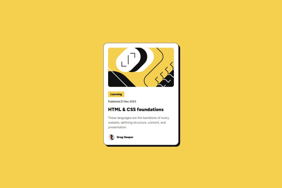
Design comparison
Solution retrospective
Any advice on responsiveness and the code itself and how to improve it.
Community feedback
- @grace-snowPosted 2 months ago
Hi,
Well done on remembering to include the link in this, so many people forget that!
Here are a few suggestions from your code:
- Really the link should be inside the heading, not the other way around.
- This would never act as a page title once the component is used on a real web page, so it shouldn't have a h1. Use a lower importance heading level like
h2
. - According to the design, the whole card should be clickable. One way to do that easily is by making the card position relative, then adding a pseudo-element to the link (e.g.
:after
) and setting that to be absolutely positioned and covering the card. Now the link will effectively cover the whole card. - On hover of that link (or pseudo or card), the shadow is meant to change a little.
- The main image is decorative in my opinion. That means it should have an empty alt value (
alt=""
). - Do you need a div for the card body? That's not really adding anything.
- Alt text shouldn't include words like "image". If you consider it meaningful it should describe what the image looks like, or if decorative the alt should be blank.
- As a general rule, don't put text in divs or spans alone, as they are meaningless elements only intended to be used for layout purposes. I'd make that learning category into a paragraph.
- The card doesn't need a min-height.
1@zmora2622Posted about 2 months ago@grace-snow Thank you for all your comments and your time. I'm taking the time to apply corrections :-)
0@zmora2622Posted about 2 months ago@grace-snow I created this div in the card block more for structure so as not to stuff everything in the body. With larger layouts there are definitely more elements and this card would just be part of the whole page. I thought of approaching the element as a single component that could be used later. I don't know if this is a good approach or just my misunderstanding. As for the minimum height, I added it to replicate what it is as much as possible. Unfortunately I noticed that when setting the parameters from figma there is always some difference of a few px.
0@grace-snowPosted about 2 months ago@zmora2622 I didn't mean the div for the card itself, that's fine. I meant I don't see a need to wrap any elements within this card in an extra div, except the author image and name. Thats the only part of the card children that needs some extra layout work, but the rest of the text in the card doesn't need an extra inner div wrapping it.
1@zmora2622Posted about 2 months ago@grace-snow Ohhh ok, I misread the answer. Probably exhaustion 😜. Thanks again for your help and I'll get on with correcting it. In fact I need to change my approach to analysing appearance a bit.
0@zmora2622Posted about 2 months ago@grace-snow I have corrected according to the guidelines. I hope I understood everything correctly :-)
0 - @tomblack9452Posted 2 months ago
This design is basically exact to the original design. The weight of the text on the main heading is slightly lighter - maybe not the same number specified on the style spec? Other than that, perfect.
1 - @MikDra1Posted 2 months ago
Responsiveness Improvements:
- Use Media Queries: Implement media queries in
style.css
to ensure the card layout adapts well to different screen sizes. - Flexbox/Grid Layout: Consider using Flexbox or CSS Grid for more flexible and responsive design.
Code Quality Enhancements:
- Semantic HTML: Ensure proper use of HTML5 semantic elements like
<article>
or<section>
for better accessibility. - CSS Optimization: Minimize CSS by combining similar styles and removing unused code.
- **Consistency: **Maintain consistent indentation and naming conventions across the project.
Hope you found this comment helpful 💗
Good job and keep going 😁😊😉
0@grace-snowPosted 2 months ago@MikDra1 This doesn't need a media query. And they are already using flexbox.
Nor does it need an article or section (they would make no difference to accessibility unless labelled anyway!).
The CSS isn't bloated.
And it's all pretty consistent.
I guess I'm asking... did you leave feedback on the wrong project perhaps?
0 - Use Media Queries: Implement media queries in
Please log in to post a comment
Log in with GitHubJoin our Discord community
Join thousands of Frontend Mentor community members taking the challenges, sharing resources, helping each other, and chatting about all things front-end!
Join our Discord