


Account Deleted
Its good i like it. My suggestion would be to try not to have too many styles in the media query. and for the main, you can just use the .container div to hold everything in. its only when your making bigger 1 or multi page sites that you would use the main header and footer tags, but for smaller components just a simple div if perfectly fine.
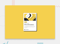
Also on your card, you dont ned and is best not to add a height and the hight will be just fine and follow the content that's in the card div itself. heres and example of a simple card i would normally write.
.card {
    width: 300px;

    border-radius: 15px;

    padding: 1rem;

    overflow: hidden;
    background: white;
    box-shadow: 8px 8px 2px 5px var(--clr-base);
    border: 1px solid var(--clr-base);
}
Thats how i styled my card. If you need any future more assistance id be happy to help.
Marked as helpful
@KollerJacq
Posted
@Benjihunt97 Thanks a lot for your tips! I immediately started working on the code and implemented your comments!
