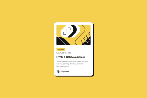
Submitted over 1 year agoA solution to the Blog preview card challenge
Blog preview card
accessibility, semantic-ui
@Omiced

Solution retrospective
What are you most proud of, and what would you do differently next time?
I was able to make better use of the figma design you provide to deliver a result that is closer to the design, I learned how to see some things in figma that I didn't know.
What challenges did you encounter, and how did you overcome them?Use the media queries I haven't used them for a long time.
Code
Loading...
Please log in to post a comment
Log in with GitHubCommunity feedback
No feedback yet. Be the first to give feedback on Josue Cano's solution.
Join our Discord community
Join thousands of Frontend Mentor community members taking the challenges, sharing resources, helping each other, and chatting about all things front-end!
Join our Discord