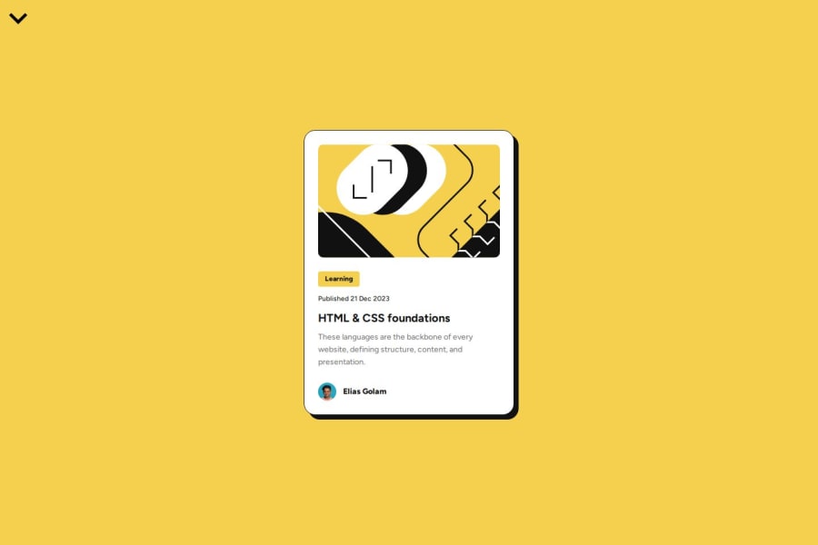
Blog Preview Card | Vue (Vite) with TS and SCSS | EliGolam
Design comparison
Solution retrospective
I am getting back into Vue, using FrontEndMentor challenges as a great way to practice my UI skills.
Community feedback
- @DylandeBruijnPosted 5 months ago
Looks great, good idea to try to get back into Vue and setup an overview site.
- Does the solution include semantic HTML?
The solution does contain semantic HTML. You could try to use more semantic elements if you feel like it. Like section and article for example.
- Is it accessible, and what improvements could be made?
The solution is accessible however some changes could be made to make it more accessible. You could try to fill in the alt attributes for images for example and make the font-size responsive instead of using px values.
Does the layout look good on a range of screen sizes?
The layout looks good on desktop but some improvements could be made for the mobile view. However this was not a requirement so not a problem in this case. You could try to make the font-size responsive.
- Is the code well-structured, readable, and reusable?
Good use of Vue and components, looks great to me! Clear names for files and CSS classes for example. I can find my way in the repository. There is some leftover boilerplate code (like the welcome component) and commented out code. I would get rid of that.
Does the solution differ considerably from the design?
Solution looks very close to the design, good job!
Marked as helpful0
Please log in to post a comment
Log in with GitHubJoin our Discord community
Join thousands of Frontend Mentor community members taking the challenges, sharing resources, helping each other, and chatting about all things front-end!
Join our Discord