Design comparison
SolutionDesign
Solution retrospective
What are you most proud of, and what would you do differently next time?
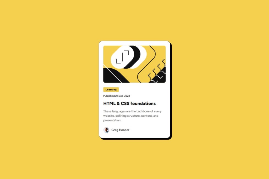
I'm happy with how accurate the solution was to the figma file. Also, I'm proud that I spent a lot of time experimenting with different ways to structure the css before I settled on this solution.
What challenges did you encounter, and how did you overcome them?I experimented with different ways of making the repeating margins more generic. You could of course implement this with specific classes for the padding sizes.
Here I solved it by setting the padding BETWEEN child elements of card
.card * {
  padding: 0;
  margin: 0;
}

.card > * + * {
  margin-top: 1.5rem;
}
I'm always happy to receive any feedback/resources on writing proper HTML/CSS :)
Community feedback
Please log in to post a comment
Log in with GitHubJoin our Discord community
Join thousands of Frontend Mentor community members taking the challenges, sharing resources, helping each other, and chatting about all things front-end!
Join our Discord
