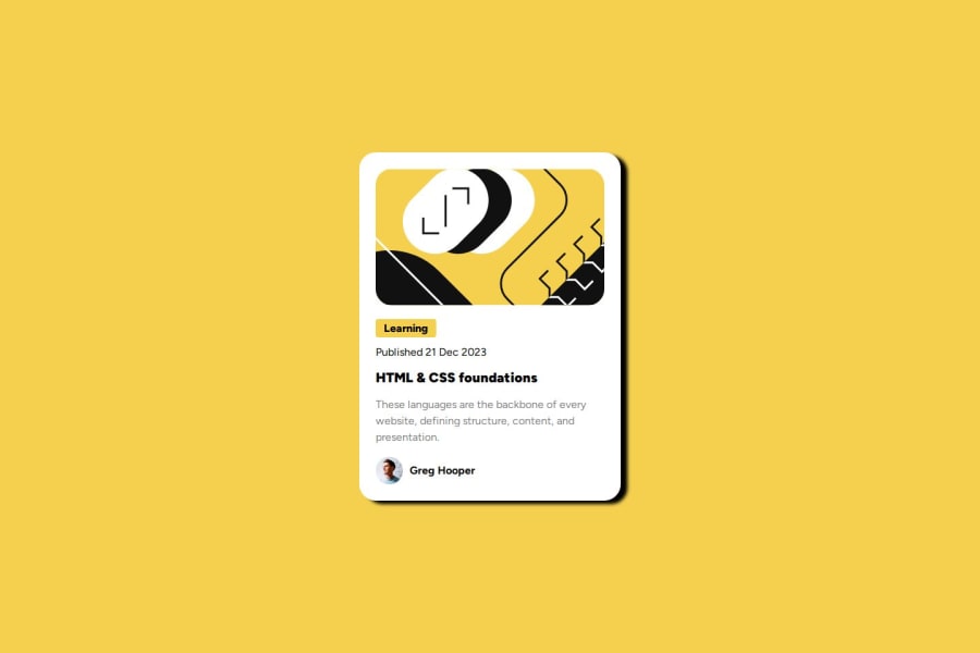
Design comparison
Solution retrospective
I'm most proud of being able to generate my remote repository and connect it to my local one a lot faster than I did previously. What I will do differently is write out my thoughts on how I'm going to tackle the project. Writing my thoughts out is more tangible then just having the thoughts in my head and will be a more effective strategy in writing clearer code.
What challenges did you encounter, and how did you overcome them?I had issues with setting a fixed size to the "card" element and when the content exceeded the height of it's container the webpage looked funny. I fixed this by changing the value of the property to "fit-content".
What specific areas of your project would you like help with?I really would like help with developing a work flow that help me to identify what classes I should be keeping in my mind prior to me writing any css.
Community feedback
- @DylandeBruijnPosted 4 months ago
@clarkjr2016
Hiya! 👋
Congratulations on your solution, it looks very close to the design! I can tell you put a lot of effort into it.
Things I like about your solution 🎉
- Use of semantic HTML elements
Things you could improve ✍️
-
I suggest adding a bit of
padding
to yourbody
element so the card has some space around it on smaller viewports. -
You could add a
min-height: 100vh
to yourbody
element so it takes up the full height of the viewport while still being able to grow when the content inside it grows. -
I suggest not setting a fixed
height
on your card or any other element like yourbody
. If the content inside your card grows you'll run into overflow issues. Try keeping theheight
atauto
whichblock
elements are by default. This allows the content to grow. -
You can set the
width
of the card to a fixed value by usingmax-width
. In combination withwidth: 100%
your card will be responsive. You'll also need to remove the fixedheight
on your image and addmax-width: 100%
. -
Try experimenting with CSS variables, they help you make your CSS values more reusable across your code.
-
I suggest using clear descriptive CSS classes like
.card
,.card-title
and.card-description
. -
Try making your solution more responsive.
-
Try adding the hover animation for the title.
I hope you find my feedback valuable, and I would appreciate it greatly if you could mark my comment as helpful if it was! 🌟
Let me know if you have more questions and I'll do my best to answer them. 🙋♂️
Happy coding! 😎
Marked as helpful1 - @DarkstarXDDPosted 4 months ago
- You shouldn't set a fixed height on the body. What you should do is give the
body
amin-height: 100vh
.vh
is viewport height. This will make the body take the full height of the screen. - The
<img>
should also be part of the<main>
. - The heading is a
<h1>
. In a proper site there will be multiple cards like these on that site. In that case<h1>
would be something else, and this will most probably be an<h2>
, because you can only have one<h1>
in a site. So you can either use a<h1>
or a<h2>
here. But not a<h4>
. Why? Because you can't skip heading levels on a site. Heading levels should go in order. First a<h1>
, then a<h2>
etc. - The
width
of the card should be changed tomax-width
. When you specify a fixed width, the card cannot go smaller than that width in smaller screen sizes. It will cause the card to overflow out of the screen. But if you usemax-width
the card can resize in smaller screen sizes. - For the "Learning" you are using a
height
. That's not needed at all. You can get it's size using padding, which you already have on it. - The
height
on the<img>
can beauto
. The<img>
needs to have amax-width: 100%
. This is usually included in a CSS reset. It's better if you start using one now. This is a good one. - You don't need to have that
fit-content
. Everything should work fine when you remove fixed heights and fixed width and only usemax-width
.
Edit: Someone else has already posted some good feedback. I didn't see that.
Marked as helpful0@clarkjr2016Posted 4 months ago@DarkstarXDD I appreciate your feedback! This is what frontend mentor is all about!
1@clarkjr2016Posted 4 months ago@DarkstarXDD again I would like to thank you for the time you took to provide your insightful replies. I learned a lot from refactoring my layout based on your suggestions, your feedback has really shown me the benefit of using this platform!
Things I learned
- Leaving the default value of
auto
onheight
is beneficial for responsive design on most elements because then that containing element's height will adjust to the combined heights of its children. - Setting a
max-width
on an element ensures that the element won't grow beyond that designated point but can get smaller when the screen size gets smaller, the opposite is true for setting amin-width
, the element won't shrink past that size but can grow once the screen size grows. - Using the
clamp
value inside of thewidth
property is pretty effective in condensing the affects of max + min width.
1@DarkstarXDDPosted 4 months ago@clarkjr2016 You are welcome! I am happy that I could help.
0 - You shouldn't set a fixed height on the body. What you should do is give the
Please log in to post a comment
Log in with GitHubJoin our Discord community
Join thousands of Frontend Mentor community members taking the challenges, sharing resources, helping each other, and chatting about all things front-end!
Join our Discord