Design comparison
Community feedback
- @rayaattaPosted 11 months ago
Hi, Excellent project👏.
I have some simple suggestion you might find interesting. I noticed that you have
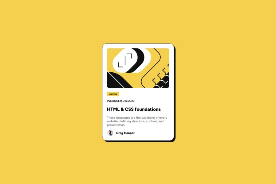
<p>Published 21 Dec 2023</p>in your code When a screen reader is reading the above it will pronounce21 Dec 2023as it is. This should be wrapped in<time datetime="2023-12-21">21 Dec 2023</time>This is machine readable therefore it is more accessible for user's with visual impairment and it is also accessible by calender such a google calender. To find out more about the time tag check out this articleOther than that your project is EXCELLENT 🤩
Happy coding 🙃
Marked as helpful2 - @git-riteshPosted 11 months ago
Your
<h1>(HTML & CSS foundations) has no effect on hover please change the color to yellow (given in thestyle-guide.md.h1:hover { color : hsl(47, 88%, 63%); }Marked as helpful1
Please log in to post a comment
Log in with GitHubJoin our Discord community
Join thousands of Frontend Mentor community members taking the challenges, sharing resources, helping each other, and chatting about all things front-end!
Join our Discord
