Submitted 8 months ago
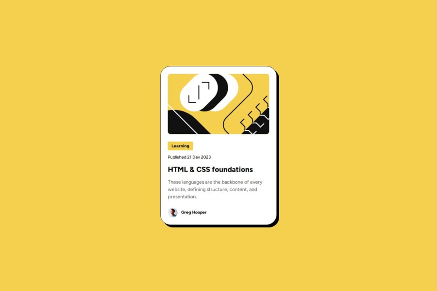
Blog preview card using Vue
#sass/scss#vue#accessibility
P
@MichaHuhn
Design comparison
SolutionDesign
Solution retrospective
What are you most proud of, and what would you do differently next time?
I learned how to navigate through the Figma mockup.
What specific areas of your project would you like help with?I implemented the typography design system like this to reuse the presets given in the style guide:
%typography-text-preset-1 {
  font-family: 'Figtree', sans-serif;
  font-size: 1.5rem;
  font-weight: 800;
  line-height: 1.5;
}
.blog-title {
  @extend %typography-text-preset-1;
}
Do you think that's a good approach or is there a better one?
I'm using so called "SCSS placeholders".
Community feedback
Please log in to post a comment
Log in with GitHubJoin our Discord community
Join thousands of Frontend Mentor community members taking the challenges, sharing resources, helping each other, and chatting about all things front-end!
Join our Discord

