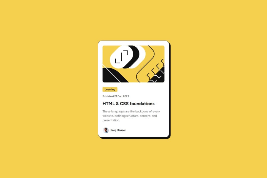
Design comparison
Community feedback
- @S44r4hPosted 2 months ago
The page looks great on both desktop and mobile! The code is clear, and I really like your class naming style—it's very readable!
Here’s some feedback:
Semantic HTML: Consider using semantic tags like <header>, <nav>, <main>, and <footer> to improve accessibility and SEO. The alt text for images is a good start. Font sizing: It’s better to use em or rem instead of px, as they are more responsive and adapt better without needing multiple media queries.
0
Please log in to post a comment
Log in with GitHubJoin our Discord community
Join thousands of Frontend Mentor community members taking the challenges, sharing resources, helping each other, and chatting about all things front-end!
Join our Discord
