Design comparison
Solution retrospective
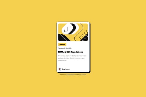
I liked how I used the CSS cascade this time to clean up the CSS a bit for the text elements. I did not fully match the design because I read the text was supposed to be smaller on mobile and the dimensions of the card looked slightly different in the design files.
What challenges did you encounter, and how did you overcome them?Organizing the text elements was difficult because they were similar, but had slight differences. I used a "p" selector to basically set a default for the paragraphs and I overwrote them slightly for each text element. That helped, but I still needed to use a lot of weird values for the units and I'm sure there is a better way.
What specific areas of your project would you like help with?I was wondering if I should have used different units for a lot of the spacing challenges I had. I tried to use a mix of em, rem, and % but I'm not sure if I did that correctly. Also, I feel like the CSS for the active states looks a little weird.
Also, I used a lot of descendant selectors like ".class1 .class2" and I'm not sure if there is an alternative or if it was even necessary to do that in most of them.
Community feedback
- @danielmrz-devPosted 6 months ago
Hello there!
Congrats on completing the challenge! ā
Your solution looks excellent!
I have just one suggestion:
- Use
<main>
to wrap the main content instead of<main>
and<article>
.
š The tag
<article>
would make more sense if the card was part of a bigger website (in certainly would in real world), but here it is all we have on the screen.Unless you have a specific reason to use both, there's no need, considering that you can achieve the same result with only one. It also makes it easier positioning the elements inside.
This tag change does not impact your project visually and makes your HTML code more semantic, improving SEO optimization as well as the accessibility of your project.
I hope it helps!
Other than that, great job!
Marked as helpful0@ryyHardyPosted 6 months ago@danielmrz-dev Hi! Thanks for your advice. I am still learning when to use a lot of the semantic HTML tags so I definitely value the feedback I get in that area. I really appreciate it.
0 - Use
- @0xabdulkhaliqPosted 6 months ago
Hello there š. Congratulations on successfully completing the challenge! š
- I have a suggestion regarding your code that I believe will be of great interest to you.
HTML š·ļø:
- This
attribution
element on your solution actually needs to be afooter
element instead ofdiv
element which causes lacking of landmark for a webpage and allows accessibility issues to screen readers.
- What is meant by landmark ?, They used to define major sections of your page instead of relying on generic elements like
<div>
or<span>
. They are use to provide a more precise detail of the structure of our webpage to the browser or screen readers
- For example:
- The
<footer>
typically contains information about the author of the section, copyright data or links to related documents.
- The
- So resolve the issue by replacing the
<div class="attribution">
into a<footer>
element in yourindex.html
file to improve accessibility and organization of your page
- Additionally you need to move out the
footer
from being inside themain
element, because themain
andfooter
elements needs to be direct child ofbody
element.
.
I hope you find this helpful š Above all, the solution you submitted is great !
Happy coding!
1@ryyHardyPosted 6 months ago@0xabdulkhalid Thank you for pointing that out! I always appreciate accessibility feedback and I want to get better at noticing those things as I work on problems.
0
Please log in to post a comment
Log in with GitHubJoin our Discord community
Join thousands of Frontend Mentor community members taking the challenges, sharing resources, helping each other, and chatting about all things front-end!
Join our Discord