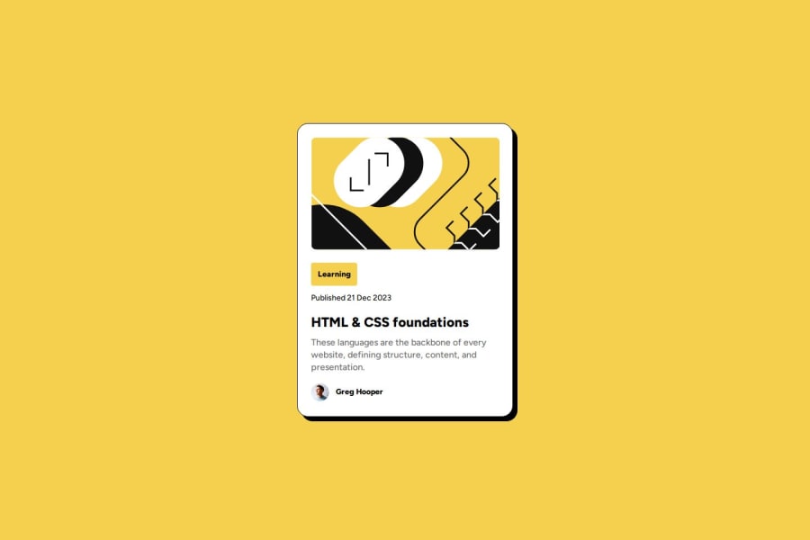


Design comparison

Solution retrospective
i tried making the app as close to the design as possible, but there were some elements i could not match properly .
Community feedback
- @EdelmiroAntonPosted 3 months ago
Hey! Congrats to finish this Challenge! I like how you apply the hover and the smooth transitions :) I should do the same haha.
Regarding to the solution, I see you did the Blog Card for desktop devices. This should be when the window widh is
>=1440pxaccording thestyle-guide.md.There are little styles differences for the mobile approach:
- There are no black borders,
- The Typography and the Card img are smallers.
I use React too, so I share this piece of code to show you how I change the Card img when the window width is
>=1440px.- First I get the window width and store the value in my width variable with useState Hook:
const [width, setWidth] = useState(window.innerWidth);- Every time the handleResize function triggers, my width variable will be updated:
const handleResize = () => { setWidth(window.innerWidth); };- Finally I use the useEffect Hook to add the Resize event listener and pass my handleResize function as callback. Also I clean-up the effect with the clean-up function before my component leaves the screen and execute the next effect (is a good practice to avoid memory leaks ;) )
  useEffect(() => {
    window.addEventListener("resize", handleResize);
    return () => window.removeEventListener("resize", handleResize);
  }, []);
Hope this feedback helps you!
Go on and Happy Coding :D
Marked as helpful1

Please log in to post a comment
Log in with GitHub
Join our Discord community
Join thousands of Frontend Mentor community members taking the challenges, sharing resources, helping each other, and chatting about all things front-end!
Join our Discord