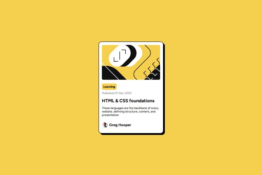
Design comparison
Solution retrospective
I learned how to use animations and :hover selector to highlight the links on the card
What challenges did you encounter, and how did you overcome them?How to load images properly on Github pages by adding "./" to the beginning of the href in tag
What specific areas of your project would you like help with?How to synchronize the shadow's animation with the highlighting of the link
Community feedback
- @Grego14Posted about 1 year ago
Hello! 🎉 congratulations on completing the challenge! 🎉
If the image has no semantic meaning or is only for decoration you can leave the alt attribute empty.
Don't skip the headings, you have an h1 and an h3, you should have an h2 before the h3.
The transition must go in the element itself and not in the state of the element, example:
.main{
  transition: box-shadow 0.1s ease-in-out;
}

h1{
  transition: color 0.1s ease-in-out;
}
not
h1:hover{
  transition: color 0.1s ease-in-out;
}
To make the title change color when you hover over the card you can use this selector:
.main:hover h1 {
  color: hsl(47, 88%, 63%);
}
There it would be selecting h1 when the .main has its hover state active.
I hope this helps! 😁
Marked as helpful0
Please log in to post a comment
Log in with GitHubJoin our Discord community
Join thousands of Frontend Mentor community members taking the challenges, sharing resources, helping each other, and chatting about all things front-end!
Join our Discord
