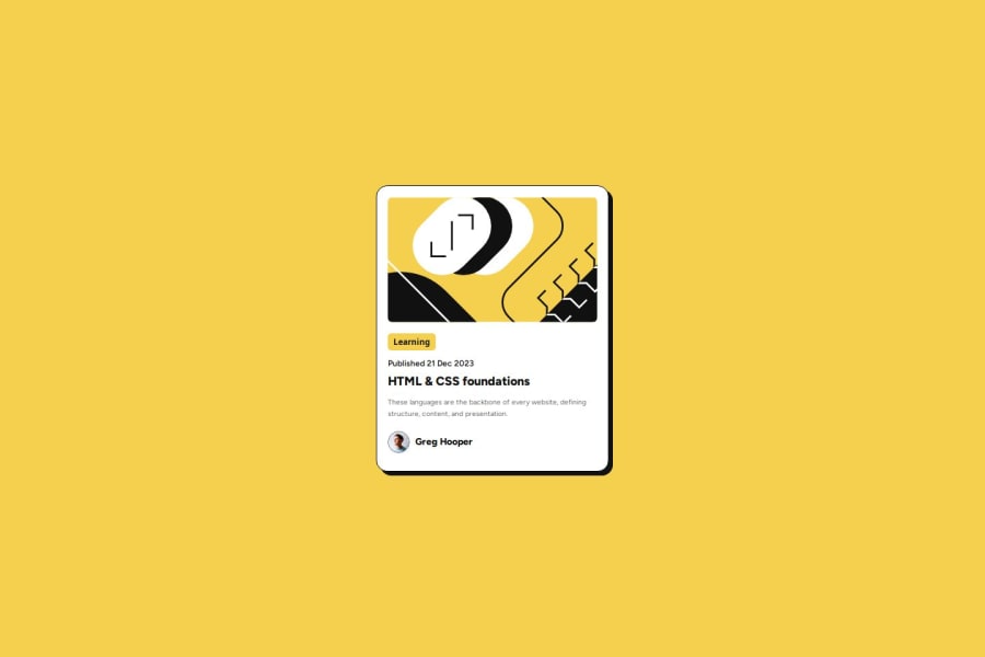
Design comparison
Solution retrospective
I'm happy I managed to make the design using no divs and semantic HTML only (slightly unsure about the footer tho), also I was used to applying fonts with CDNs only, so I'm happy with how I structured the CSS for locally downloaded fonts.
The challenge took me only around 15 minutes but then I wasted 1 hour trying to make it pixel perfect XD
for the next challenge I want to try to implement ARIA Labels and other accessibility stuff & BES to structure my CSS.
What challenges did you encounter, and how did you overcome them?Tbh nothing but I was unsure about what HTML element assign to some stuff, like it would make sense for the "learning" tag to be a button but idk and I made the blog title's an H1 with an :hover pseudo-class but only because I saw active-state png.
Now that I think about it I guess that it should have been a link tag nested(?) inside, but having all of the card be clickable and redirect to the blog article would make even more sense...oh well.
Community feedback
- @KapteynUniversePosted 1 day ago
Hey Giovanni, nice job.
Yes, active states means that element is interactable, a hyperlink for this case. For the "learning", i think that is just a category name of the article, so a p tag or any semanticly better tag might be better. It doesn't have an active state on the design too. But that doesn't mean you have to do everything according to design. Some people change everything, some adds new stuff like animations, progress is what matters.
Also i see you used rem on the description, why not on the other elements?
Edit; 2 hours later i saw your qr code solution. For the question you asked there; these 2 challenges have figma files. On figma, you can see font sizes, gaps, box shadow etc. For the normal challenges, you have to eyeball it. But, font sizes and colors provided in the style-guide.md. Again, but, font sizes and spacings usually change from mobile to desktop desing, so that is up to you.
Marked as helpful1@giovanni-bandinelliPosted 1 day ago@KapteynUniverse Hey man, thanks for the feedback.
But that doesn't mean you have to do everything according to design. Some people change everything, some add new stuff like animations; progress is what matters.
I suppose you're right. I should stress less about replicating everything 1:1 in terms of UI and try to add my own spin when I feel like it.
you used rem on the description, why not on the other elements?
Great question ahah to be honest, as someone who’s not a frontend developer, I tend to be inconsistent with how I apply styles. I just go with whatever feels intuitive at the moment. That said, I do recognize that this can become a nightmare to manage, especially with more complex designs—been there, done that!
Ah and thanks again for also answering my question on also the other solution, I dont know why I even ignored the Figma files twice, what a silly oversight
0@KapteynUniversePosted 1 day ago@giovanni-bandinelli That can be a nightmare for some other people too :D Rem is a relative unit, people with visual impairments may be changing the font size on their browser but if the font size on the web page is a fixed unit like pixel, it won't work. So i recommend you to use rem especially for the font-sizes and media queries.
0
Please log in to post a comment
Log in with GitHubJoin our Discord community
Join thousands of Frontend Mentor community members taking the challenges, sharing resources, helping each other, and chatting about all things front-end!
Join our Discord