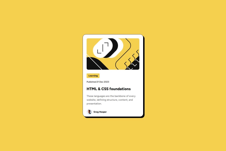
Blog Preview Card using majorly flex and centered by grid
Design comparison
Solution retrospective
I practicing in flex and I will grid next time.
What challenges did you encounter, and how did you overcome them?basically aligning the item perfectly and try to use right fonts. I overcome this by using google font helper and figma to find the right sizes.
What specific areas of your project would you like help with?I want to know how to reduce the code, because basically I am doing so much repeating code by my assumption.
Community feedback
- @wpittman06Posted 6 months ago
The layout looks good. There is some spacing differences but it doesn't ruin the project. The naming convention is consistent and the code is readable. Did a great job on the project overall.
0
Please log in to post a comment
Log in with GitHubJoin our Discord community
Join thousands of Frontend Mentor community members taking the challenges, sharing resources, helping each other, and chatting about all things front-end!
Join our Discord
