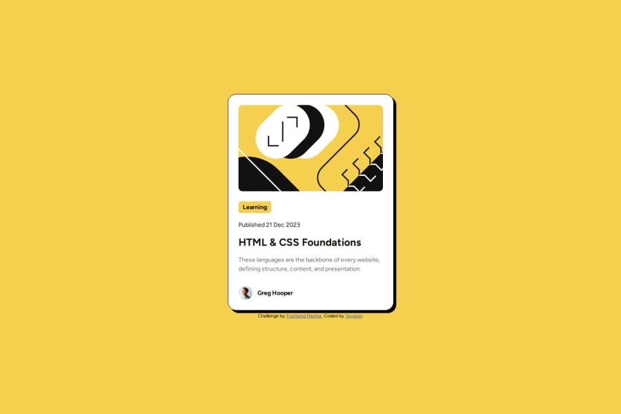
Design comparison
Solution retrospective
I was much faster at coding and figuring out what I needed to do for this project compared to the QR Code one. I also grew more familiar with Figma.
What challenges did you encounter, and how did you overcome them?I had trouble with the "Learning" part because I couldn't figure out how to make the yellow background color smaller. I solved it by adding a span element and styling that in CSS instead.
What specific areas of your project would you like help with?Any redundancies or unclear code in my CSS or HTML. Whether or not I could have used a better way to code my project.
Community feedback
- @CptnRedbeardPosted 7 months ago
You got this! It looks like you just need to:
- Make the height a little bigger.
- Your box-shadow may need to be a little thicker.
- Weight for font should be thicker in the h1. Nice job!!
Marked as helpful0
Please log in to post a comment
Log in with GitHubJoin our Discord community
Join thousands of Frontend Mentor community members taking the challenges, sharing resources, helping each other, and chatting about all things front-end!
Join our Discord
