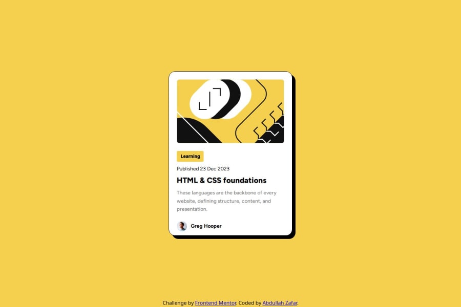
Design comparison
Solution retrospective
I'm so proud of making beautiful websites by looking through the design and trying my best to replicate it as much as possible. For the next time, I will to enhance my skills so that I can make dynamic apps ASAP.
What challenges did you encounter, and how did you overcome them?At first, I didn't know about using external fonts and declaring variables for colors, and by looking at other people's code, I learned that this is also possible in CSS.
What specific areas of your project would you like help with?Not specifically any area for this time.
Community feedback
- @krushnasinnarkarPosted 4 months ago
Hi @ei-abdullah,
Congratulations on successfully completing the challenge!
I have some suggestions regarding your code that I believe will be of great interest to you.
-
Main Element Height: You can remove the height from the main element as it is not required. This will also eliminate the small gap between the about section and the bottom of the card.
-
Hover Effect: Adding a hover effect to the card, such as a shadow, will enhance the user experience. This is also in line with the challenge brief, which states that users should be able to see hover and focus states for all interactive elements on the page. You can achieve this by adding:
.card:hover { box-shadow: 0 4px 8px rgba(0, 0, 0, 0.2); }
-
Responsive Main Element: Instead of using a media query to reduce the width of the main element, you can change the
width: 384px;
tomax-width: 384px;
. This will automatically reduce the width if the screen size is smaller than 384px:main { max-width: 384px; }
I hope you find this helpful, and I would greatly appreciate it if you could mark my comment as helpful if it was.
Feel free to reach out if you have more questions or need further assistance.
Happy coding!
0@ei-abdullahPosted 4 months ago@krushnasinnarkar Thanks for your guidance, I will apply these techniques surely in my upcoming challenges and projects. I appreciate you.
0@geomydasPosted 4 months ago@krushnasinnarkar I would reccomend aswell to change the max-width from px unit to rem unit. It would be more accesible to people who change their font sizes and its pretty simple to convert your px to rem just by dividing by 16.
Example: 16px = 1rem, 8px = 0.5rem
0 -
Please log in to post a comment
Log in with GitHubJoin our Discord community
Join thousands of Frontend Mentor community members taking the challenges, sharing resources, helping each other, and chatting about all things front-end!
Join our Discord