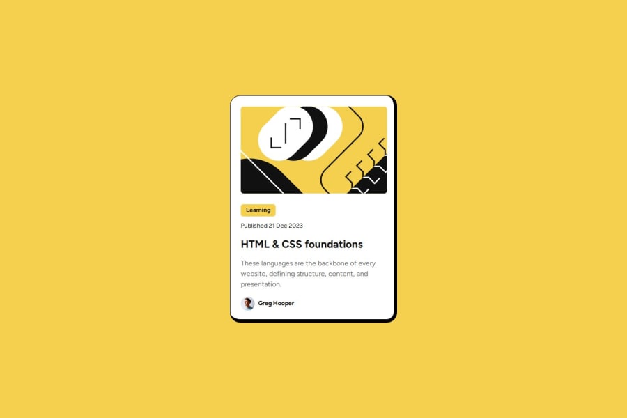
Blog preview card using HTML5 and Tailwind CSS
Design comparison
Solution retrospective
Most proud of: The finished look of the product and how quickly I was able to complete it. It was a definite improvement on the last challenge.
What I'd do differently: Take extra time to go over the design brief once I thought I'd finished. I almost didn't do this and would have missed off some styling.
What challenges did you encounter, and how did you overcome them?At first, I found it difficult to centre the component in the middle of the page. After messing around with different styling, I eventually looked online to see if anybody had a simple solution and I was able to find one that was much easier than mine.
What specific areas of your project would you like help with?- Could I have got my code any cleaner/easier to read?
- Is there anything I've missed with the design?
Community feedback
- @VRuanFabPosted 3 months ago
Amazing job, i just think the difference is in the "learning" text missing bold
0
Please log in to post a comment
Log in with GitHubJoin our Discord community
Join thousands of Frontend Mentor community members taking the challenges, sharing resources, helping each other, and chatting about all things front-end!
Join our Discord
