Design comparison
Solution retrospective
Completing another challenge on FEM.
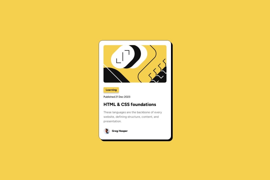
What challenges did you encounter, and how did you overcome them?On mobile display, had an issue getting the blog-image to look like the Figma design. Wasn't sure if it uses a different image entirely or if there was a way to manipulate the svg to look different at different sizes.
Also, when adding a hard-coded height to the blog-image, the border radius disappeared at smaller screen sizes.
What specific areas of your project would you like help with?Figuring out the solution to the aforementioned challenge.
Community feedback
- @MuliroMattPosted 11 months ago
looks great! Something i would do is adding a transition to your hover.
0
Please log in to post a comment
Log in with GitHubJoin our Discord community
Join thousands of Frontend Mentor community members taking the challenges, sharing resources, helping each other, and chatting about all things front-end!
Join our Discord
