Not Found
Not Found
Not Found
Not Found
Not Found
Not Found
Not Found
Not Found
Not Found
Not Found
Not Found
Not Found
Not Found
Not Found
Not Found
Not Found
Not Found
Not Found
Not Found
Not Found

Submitted

Blog preview card using HTML, CSS

@piyumi-1991

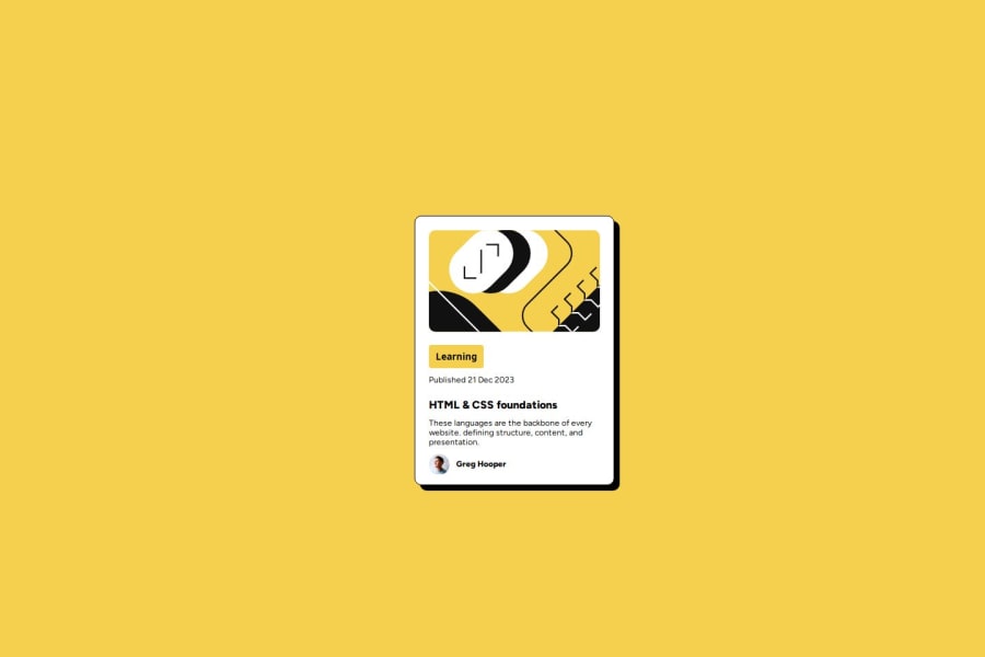
Desktop design screenshot for the Blog preview card coding challenge

This is a solution for...

  • HTML
  • CSS
1newbie
View challenge

Design comparison


SolutionDesign

Solution retrospective


What are you most proud of, and what would you do differently next time?

I think I was able to design this web page more similar to the challenge which is provided. It's a win compared to the previous challenge. Added some CSS features like flexbox, grid.

What challenges did you encounter, and how did you overcome them?

align the div center of the web page was a challenge. Fixed that issue by googling the solution.

Community feedback

Francesco 270

@FraCav99

Posted

Hi Piyumi, congrats on completing this challenge!

Just some hints to help you write better HTML for future challenges.

Avoid too much <div>s in your markup.

By definition from MDN:

The <div> HTML element is the generic container for flow content. It has no effect on the content or layout until styled in some way using CSS (e.g. styling is directly applied to it, or some kind of layout model like Flexbox is applied to its parent element).

Basically, has no meaning, cause it's just a generic container. Also using lots of divs inside the markup makes hard to understand what each part of markup is referring to (maybe a navbar, a sidebar?, for example).

It's useful in cases like, taking from your solutions, to organize related things in a group, like you did in the author's details.

Instead of using a <button> for the tag Learning, I've rather used a <p>.

That's beacuse we don't need to do an action with it, but it's just a presentative thing.

You used lots of <p>, which is not bad per se, but not all the text should be a paragraph. Some text is meant to be intrudoctory, like a title.

In this example the title of the card with the class .course-title, would have been an <h1> instead of <p>.

<h1> is a heading, there are six levels of them (<h1> - <h6>) but <h4> to <h6> are barely used.

Another thing is, naturally some elements occupy all the available width (in CSS are called block level elements, so they naturally stack vertically and save you from adding extra markup for this.

An example from your solutions for this is:

        <div class="learning-btn-div">
            <button class="learning-btn">Learning</button>
        </div>

button is an inline element, which means it will occupy only the necessary width, based on the size of its content. You can change the behaviour of these elements by simply changing their display property from block to inline (or viceversa or to inline-block as well, which combine the best of both worlds. I suggest you to study which are the differences between all of these three.)

so an alternative to this would be, for example:

<p class="learning-tag">Learning</p>

After all of this, an alternative and more semantically version of your solution would be:

    <div class="blog-card">
        <img class="illustration" src="assets/images/illustration-article.svg" alt="illustration">

        <p class="learning-tag">Learning</p>

            <p class="date">Published <time datetime="2023-12-21">21 Dec 2023</time></p>

            <h1 class="course-title">HTML & CSS foundations</h1>

            <p class="course-description">These languages are the backbone of every website. defining structure,
                content,
                and presentation.
</p>

        <footer class="tutor-details-div">
            <img class="tutor-img" src="assets/images/image-avatar.webp" alt="avatar">
            <p class="tutor-name">Greg Hooper</p>
        </footer>
    </div>

To summarize, writing semantic HTML helps you better write organize and your content on the page (and it's a plus for accessibility as well!)

As you can see I used other different tags like <footer> or <time>. Those are just a bonus to show that in the HTML there are lots of elements, each with their appropriate usages.

It may seems scary at first, but don't worry, in practical use cases people don't use all of them, but just a bunch, some have just a very niche case of use. It's just a matter of building an intuition and referring to the MDN docs time to time! :)

For the CSS part, it's overall good, but avoid using pixels as units for font-sizes. Rather use rem units.

This beacuse if users take time to change the default font size from browser settings, the changes wouldn't be reflected and the users would have hard time to read the content of your page.

To summarize all, I know that there are lots of things going on, but don't be scared by it! You did great and also completed another challenge!

I hope my explanation will be useful to you! :)

Also I leave you some good articles to read from Josh Comeau blog:

If you have any question, don't hesitate to ask!

Happy coding! :)

0

Please log in to post a comment

Log in with GitHub
Discord logo

Join our Discord community

Join thousands of Frontend Mentor community members taking the challenges, sharing resources, helping each other, and chatting about all things front-end!

Join our Discord