Submitted 4 months ago
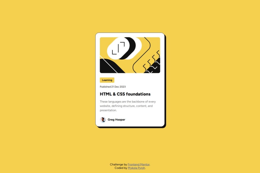
Blog preview card (Using HTML, SCSS and BEM)
#sass/scss#bem
P
@mykola-pyroh
Design comparison
SolutionDesign
Community feedback
- @FerdiansyahmulyadiPosted 4 months ago
Hi @mykola-pyroh,
This looks good, the blog preview card looks the same as the design. I think we can improve it in some ways:
- Make a container to wrap the blog preview card
- Code the container with max-width and max-height to match the width and height of the preview card.
- Set the margin of the container, so that the top, bottom, left, and right stay center.
Here is my .container code, by the way, I use SCSS to complete this challenge: .container { max-width: rem-calc(384); max-height: rem-calc(522); padding: 0 0; margin: rem-calc(219) auto; }
Good luck!
0
Please log in to post a comment
Log in with GitHubJoin our Discord community
Join thousands of Frontend Mentor community members taking the challenges, sharing resources, helping each other, and chatting about all things front-end!
Join our Discord
