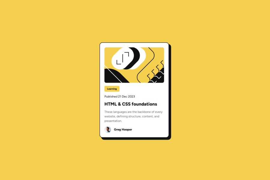
Design comparison
SolutionDesign
Solution retrospective
What are you most proud of, and what would you do differently next time?
My use of BEM naming convention and modern CSS for responsiveness.
What challenges did you encounter, and how did you overcome them?Trying to apply the box shadow to the main element. I was trying another thing entirely until I remembered the box shadow.
Community feedback
- P@adhSwedePosted 6 months ago
- Colors look good.
- Correct Fonts and Font weights across the board.
- Dimensions looks fairly close.
- Description in <img> tag was better than mine.
- I can tell there was an effort to use semantic tags. I do not recognize them all but that could be on me.
- Nice and neat code structure. Looke like prettier was being used.
- Dimensions are a little off, but nothing too serious.
- Could do with a little commenting. I like to pretend someone else might read my code, even if that isn't always the case.
Nicely done!
Marked as helpful0
Please log in to post a comment
Log in with GitHubJoin our Discord community
Join thousands of Frontend Mentor community members taking the challenges, sharing resources, helping each other, and chatting about all things front-end!
Join our Discord
