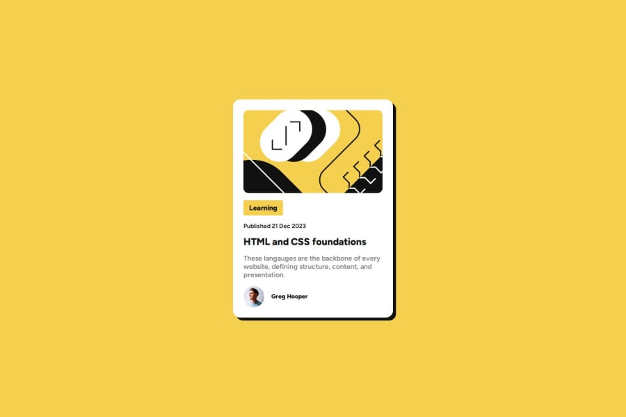
Design comparison
Solution retrospective
Using the :root method in my CSS stylesheet was very useful. It was suggested to me by another developer in the mentor community and it really helped keep track of the main colors and fonts I needed to use for the project.
:root{
    --clr-Yellow: #f4d04e;
    --clr-White: #ffffff;
    --clr-Grey: #808080;
    --clr-Black: #121212;

    --ff-main: "Figtree", sans-serif;
    --fs-main: 16px;
    --fw-600: 600;
    --fw-800: 800;
}
The whole process was pretty easy and intuitive so I didn't come across any problems
What specific areas of your project would you like help with?I can't think of anything I need help with at this moment in time.
Community feedback
- @asimsaeed353Posted 7 months ago
Repository link is not working. So, I can't see the code. Live website link is working, and the card design is great. Keep up the good work. 👍
0
Please log in to post a comment
Log in with GitHubJoin our Discord community
Join thousands of Frontend Mentor community members taking the challenges, sharing resources, helping each other, and chatting about all things front-end!
Join our Discord
