
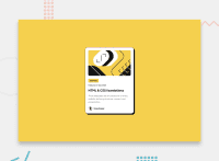
Design comparison


Solution retrospective
I found it difficult to make the design responsive.
What specific areas of your project would you like help with?I would like someone help me about making design layout responsive. I tried my best, but the code didn't seem to be working. If someone could read my code and help me find bug(s) in my code.
Community feedback
- @Demaxs26Posted about 2 months ago
Hi, you did a well job !
For the responsive you just need to define the size of the main box in % or vh instead of px :
.main{ width: 100%; height: 100vh; }and to not set the size of the card :
.card{ width: fit-content; height: fit-content;normally with that you dont need to use any media screen so you can just remove them i think
have a nice day !
Marked as helpful0@asimsaeed353Posted about 2 months ago@Demaxs26 It actually helped and the code is working even without writing media queries. Thanks a lot!
1

Please log in to post a comment
Log in with GitHub
Join our Discord community
Join thousands of Frontend Mentor community members taking the challenges, sharing resources, helping each other, and chatting about all things front-end!
Join our Discord