

Design comparison

Solution retrospective
Aligned and used the provided styles seamlessly.
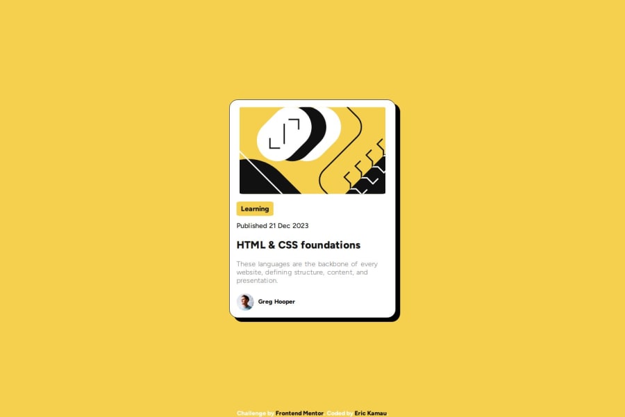
What challenges did you encounter, and how did you overcome them?- Resizing the author image, had to create a span element and give it a width and height and then resized the image to fit the span.
Flex-box and Image resizing - but i'll grasp the concepts completely with more practice. I shall continue coding the site until it looks like the provided one perfectly.
Community feedback
- @e-liaszPosted 10 months ago
I think the solution looks great and very close to the design on hand. I highly enjoy the way the CSS is structured and cut into chunks, it makes it very clear and readable. If I may suggest one thing, I believe the
border-radiusvalues could be a bit higher on the top image to create a more seamless look with the card component, as well as thebox-shadowexpanding in an active state. But those are minor things, all in all it's a great solution.0

Please log in to post a comment
Log in with GitHubJoin our Discord community
Join thousands of Frontend Mentor community members taking the challenges, sharing resources, helping each other, and chatting about all things front-end!
Join our Discord