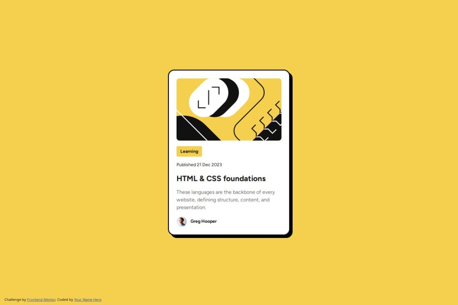
Design comparison
SolutionDesign
Solution retrospective
What are you most proud of, and what would you do differently next time?
solving different problems on my own
What challenges did you encounter, and how did you overcome them?seeing design discrepancies between mobile and desktop on figma and discovering them myself
What specific areas of your project would you like help with?javascript
Community feedback
- @latifa-wakiliPosted 5 months ago
your design is great just change container's border to 1px
keep it up!
Marked as helpful0
Please log in to post a comment
Log in with GitHubJoin our Discord community
Join thousands of Frontend Mentor community members taking the challenges, sharing resources, helping each other, and chatting about all things front-end!
Join our Discord
