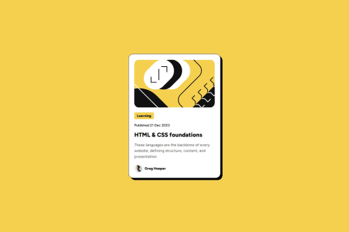
Submitted over 1 year agoA solution to the Blog preview card challenge
Blog preview card using HTML & CSS
@code269

Solution retrospective
What are you most proud of, and what would you do differently next time?
I usually don't use properties such as box-shadow, but was pleased it worked out easier than I expected.
What challenges did you encounter, and how did you overcome them?Didn't feel challenged but I did have to look up some docs on box shadow due to unfamiliarity.
What specific areas of your project would you like help with?As always, want to make sure my code follows professional standards such as placement, class names, and modularity.
Code
Loading...
Please log in to post a comment
Log in with GitHubCommunity feedback
No feedback yet. Be the first to give feedback on Zi's solution.
Join our Discord community
Join thousands of Frontend Mentor community members taking the challenges, sharing resources, helping each other, and chatting about all things front-end!
Join our Discord