Submitted 6 months ago
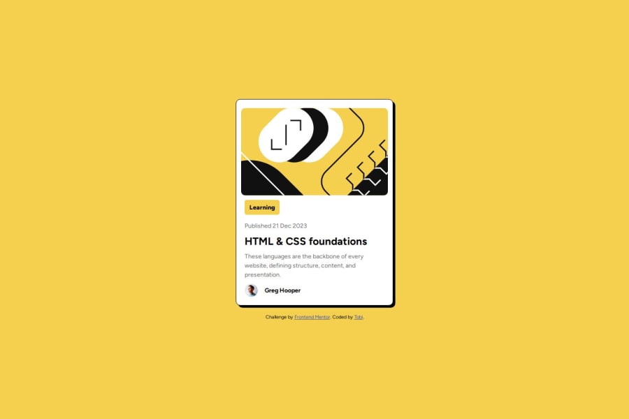
Blog Preview Card using html and css
#accessibility
@Tobai24
Design comparison
SolutionDesign
Solution retrospective
What are you most proud of, and what would you do differently next time?
I practiced some of the things i have learnt from tutorials . i also learnt how to place a text beside an image like what we did for the second image. 😊
What specific areas of your project would you like help with?How do i use the figma file. Although I checked online i could not use the Dev tools.
Community feedback
Please log in to post a comment
Log in with GitHubJoin our Discord community
Join thousands of Frontend Mentor community members taking the challenges, sharing resources, helping each other, and chatting about all things front-end!
Join our Discord
