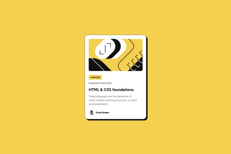


Design comparison

Solution retrospective
I'm proud of my improvements made from my last project including using CSS Reset, accurately centering without fixed pixels, using flexbox for the first time, and using Figma Design Guides to help with measurements.
Next time, I would try to work on using rem measurements for more responsiveness. I'm not exactly sure the calculation to use to get the right number. I think it's all based off of default HTML font size of 16px but not 100% sure.
What challenges did you encounter, and how did you overcome them?The most challenging part for me was getting "Learning" centered in the div. I think there was some margin overlap that was causing my padding on the text to jump significantly. One pixel of padding would end up being 20px or so. The CSS Reset eliminated this problem.
What specific areas of your project would you like help with?I can't figure out why cursor: pointer; only works sometimes? It seems glitchy, like I see it for a moment and then it disappears. Might be something with my code.
Would love to know how to calculate rem measurements!
Community feedback
Please log in to post a comment
Log in with GitHub
Join our Discord community
Join thousands of Frontend Mentor community members taking the challenges, sharing resources, helping each other, and chatting about all things front-end!
Join our Discord