Submitted about 1 month ago
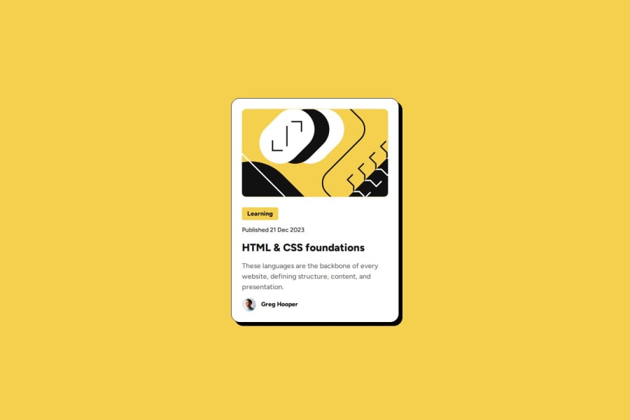
Blog Preview Card using HTML & CSS
#accessibility#materialize-css

P
@stevensuna

Design comparison
SolutionDesign

Solution retrospective
What are you most proud of, and what would you do differently next time?
- Design Token Implementation
:root {
  /* Systematic approach to storing design decisions */
  --color-yellow: hsl(47, 88%, 63%);
  --font-size-base: 1rem;
  --spacing-md: 1.5rem;
  --card-width-mobile: 20.4375rem;
}
- Mobile-First Approach
/* Base mobile styles */
.card {
  width: var(--card-width-mobile);
  padding: var(--spacing-md);
}

/* Desktop overrides */
@media (min-width: 48rem) {
  .card {
    width: var(--card-width-desktop);
  }
}
Key Learnings
- Structured design tokens for maintainable CSS
- Mobile-first responsive design principles
- CSS custom properties for flexible theming
- Progressive enhancement workflow
- Systematic spacing and typography scales
Community feedback
- @YacoubDweikPosted about 1 month ago
Good job!
There's no need to give the main a max-width of 1440px and a width of the same value as well, my Laptop screen is 1500px and I saw white areas on left and right, no need at all, the main should be always 100%.
Keep it up!
0 - P@amancalledkiddPosted 3 months ago
Amazing job, look identical to designs and code is written clearly with understandable notes.
Great use of variables makes the project very scaleable.
Semantic HTML and use of alt makes code accessible.
Great work!
0


Please log in to post a comment
Log in with GitHub
Join our Discord community
Join thousands of Frontend Mentor community members taking the challenges, sharing resources, helping each other, and chatting about all things front-end!
Join our Discord