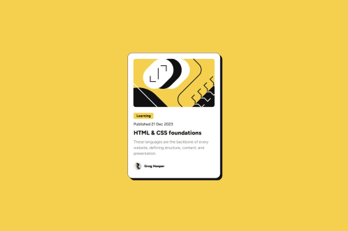
Blog Preview Card using HTML and CSS Flexbox

Solution retrospective
I became more familiar with how to use CSS Flexbox to position elements. I also learned how to use Figma with the fig files to measure each component and the spacing between them. I tried to stay away from hardcoding px values to size elements but used rem where possible.
I would focus more on how to structure the HTML with semantic elements and use classes/ids better.
What challenges did you encounter, and how did you overcome them?I had a couple of challenges with this project.
First was learning how to structure the HTML so that I could use Flexbox efficiently to keep the CSS as clean as possible. I overcame this by watching tutorials and reading up on Flexbox. I found that "thinking in boxes" when looking at the design was helpful here as well.
The second challenge was knowing the correct semantic elements to use in my HTML. I consulted the HTML Standard to try to overcome this challenge.
What specific areas of your project would you like help with?Anything really but particularly my use of Flexbox and semantic HTML tags / structure would be great.
Was my HTML structured in a way that makes sense for Flexbox?
Did I use Flexbox in an efficient way? Can I do better here?
Please log in to post a comment
Log in with GitHubCommunity feedback
No feedback yet. Be the first to give feedback on JNeo77's solution.
Join our Discord community
Join thousands of Frontend Mentor community members taking the challenges, sharing resources, helping each other, and chatting about all things front-end!
Join our Discord