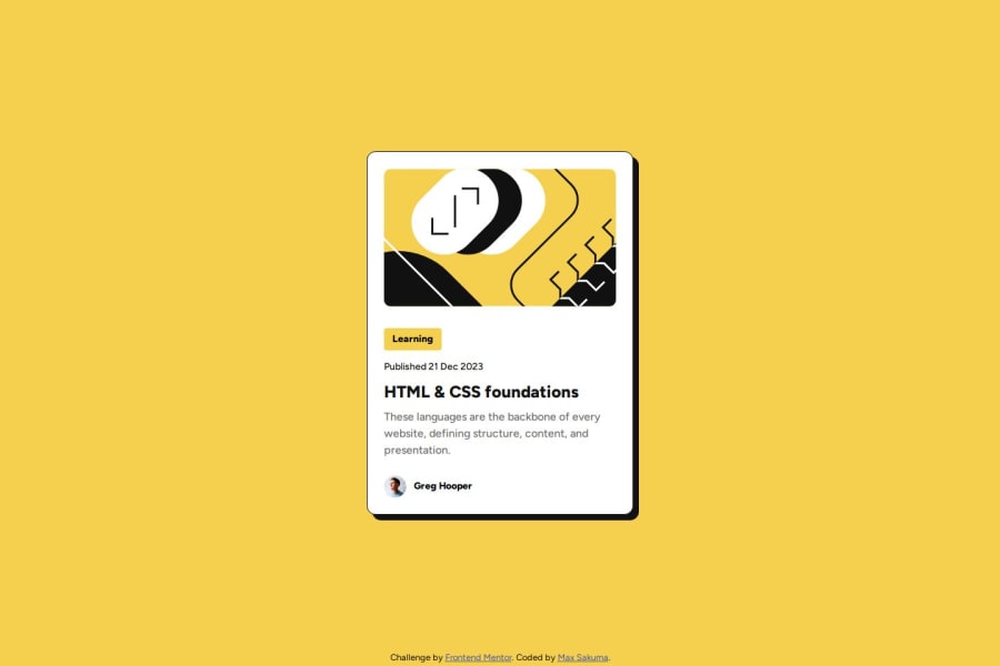
Design comparison
Solution retrospective
I'm happy that I was able to understand the last feedback and apply to this project. Specially on the usage of rem and em for font-sizes. I'm also confident that the final project is pretty close to the Figma files.
I would try to set the margins and paddings more closely to the Figma files and maybe add features that are not within the current scope. I would also like to understand how to properly set OG Meta to this.
What challenges did you encounter, and how did you overcome them?To make the image crop and behave like the Figma files took me a few tries and search for online tutorial. As per usual, the content of Kevin Powell was extremely useful.
What specific areas of your project would you like help with?It would be great to have some feedback on the BEM Methodology, ARIA and if there are any improvements on the CSS file that would make it shorter, but behave the same.
Community feedback
Please log in to post a comment
Log in with GitHubJoin our Discord community
Join thousands of Frontend Mentor community members taking the challenges, sharing resources, helping each other, and chatting about all things front-end!
Join our Discord
