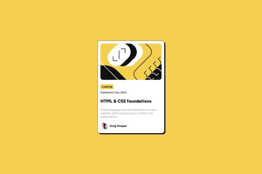
Design comparison
SolutionDesign
Solution retrospective
What are you most proud of, and what would you do differently next time?
I was able to bring the site closer to the design without using figma
What challenges did you encounter, and how did you overcome them?not able to get the text sizing right. Having trouble figuring out asset size without rendering it on screen.
What specific areas of your project would you like help with?Nothing specific at this time.
Community feedback
- @Nyerhowho9Posted 11 months ago
The desktop view of the page looks good. Your solutiion looks siimiilar to the design. However, there is nothing happents on a hover event. You didn't add that styling. Also, the page is not responsive at all.
0
Please log in to post a comment
Log in with GitHubJoin our Discord community
Join thousands of Frontend Mentor community members taking the challenges, sharing resources, helping each other, and chatting about all things front-end!
Join our Discord
