Design comparison
SolutionDesign
Community feedback
- @ajasmine94Posted 6 months ago
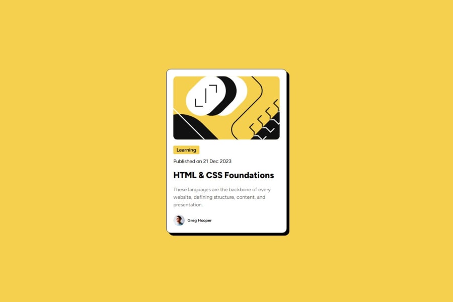
This looks amazing! You made it so close to the actual design... What I noticed is that, you used a backdrop and set its position behind the actual card, I believe you can also use box-shadow and alter its parameter to make it work just like in the design :) But your usage of the backdrop in the css is also another alternative solution :)
0
Please log in to post a comment
Log in with GitHubJoin our Discord community
Join thousands of Frontend Mentor community members taking the challenges, sharing resources, helping each other, and chatting about all things front-end!
Join our Discord
