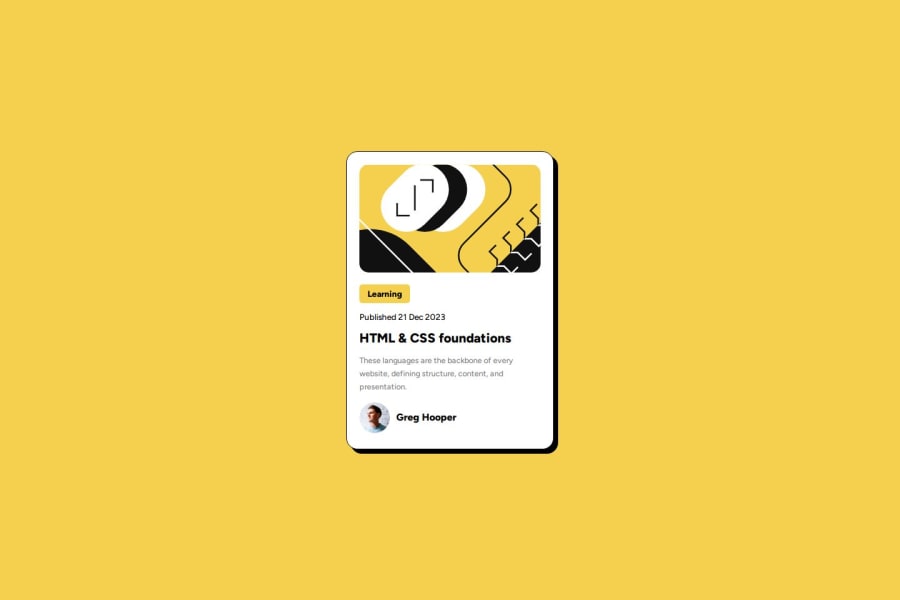


Design comparison
SolutionDesign

Solution retrospective
What are you most proud of, and what would you do differently next time?
I am most proud of the speed of completion as well as learning new skills such as using em and rem instead of pixels. I had a much easier time managing the github and deployment as well as creating the design.
What challenges did you encounter, and how did you overcome them?I encountered challenges working with the image sizing as well as layering all the elements on top of each other.
Community feedback
Please log in to post a comment
Log in with GitHub
Join our Discord community
Join thousands of Frontend Mentor community members taking the challenges, sharing resources, helping each other, and chatting about all things front-end!
Join our Discord