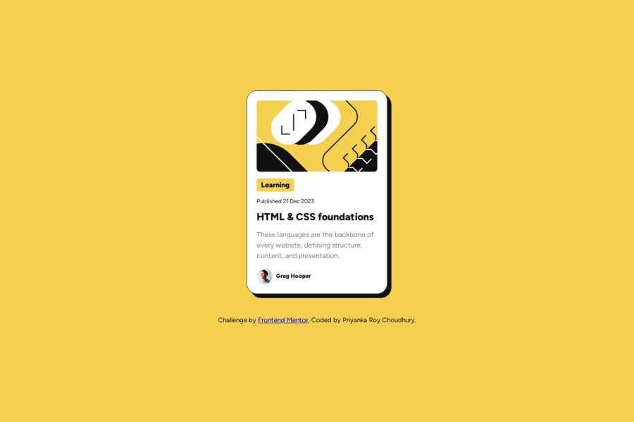
Design comparison
SolutionDesign
Solution retrospective
Hello
Any feedback is appreciated!
Thank you
Priyanka
Community feedback
- @AGutierrezRPosted 11 months ago
Hello there @PriyankaRC16 👋. Good job on completing the challenge!
I have some suggestions about your code that might interest you.
General Structure and HTML:
- Wrap the primary content within the
<main>tag instead of using it as a standalone component like a<div>. - All the content should be contained within landmarks. Every page minimally needs a
<main>element. - Consider using
<span>or<time>instead of paragraphs for elements that are not actual paragraphs like "Learning" and "Published...".
CSS and Styling:
- Instead of fixed widths, employ
max-widthandmin-widthfor flexible and responsive design. Replace thewidth: 20emfrom the.cardfor amax-width: 20em. - Let the content decide the height of the elements. Use padding and margins strategically for this purpose.
Accessibility and Semantic HTML:
- The icons/illustration images are decorative, so their alt text must be empty:
alt="". - Profile image could benefit from a more descriptive alt text, like
alt="Headshot of Greg Hooper".
I hope you find this helpful 😁. Most importantly, your submitted solution is fantastic!
Happy coding!
Marked as helpful0 - Wrap the primary content within the
- @BlackpachamamePosted 11 months ago
Greetings @PriyankaRC16! you have done an incredible job.
I leave you some comments in case they help you:
- Reset the
marginin the universal selector*withmargin: 0. This will eliminate those annoying scrolls - Add a
gap: 8pxto yourcard-textclass to fix the change above - You can adjust the width of the avatar image so that it is correct:
.avatar-and-text > img {
    width: 35px;
    height: auto;
}
Marked as helpful0 - Reset the
Please log in to post a comment
Log in with GitHubJoin our Discord community
Join thousands of Frontend Mentor community members taking the challenges, sharing resources, helping each other, and chatting about all things front-end!
Join our Discord
