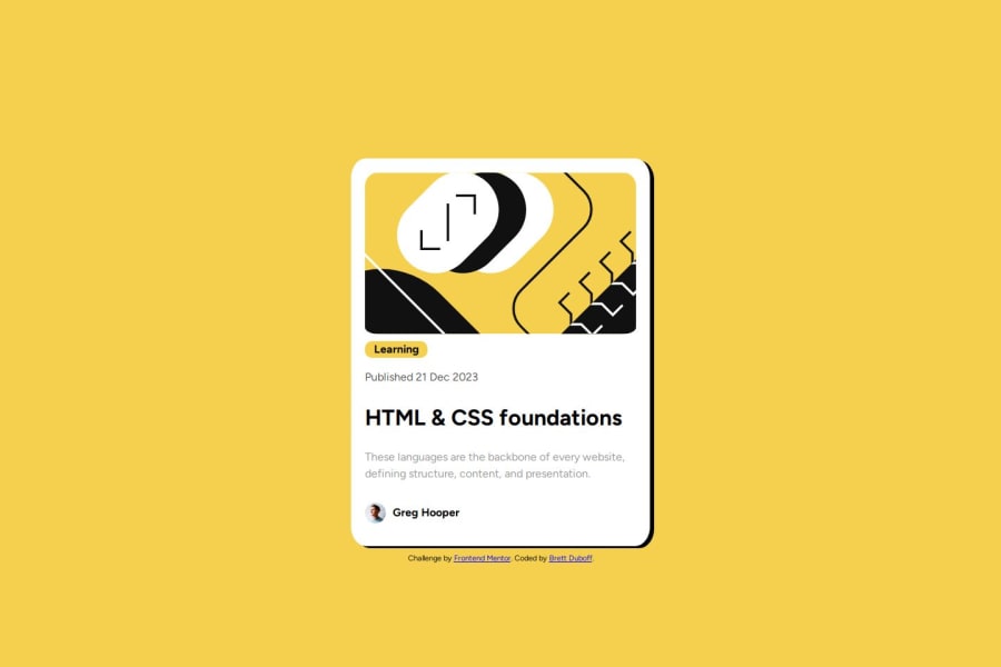
Design comparison
Solution retrospective
I feel like I'm getting better after every time I do this.
What challenges did you encounter, and how did you overcome them?I initially had issues with centering the image. I manage to get help on the discord and a few people had the answer I was looking for.
I also had issues with the caption bar but I managed to figure that out on my own.
What specific areas of your project would you like help with?If there is a way to have a cleaner CSS page, that would be appreciated.
Community feedback
- @DILHTPosted 6 months ago
Great job on the design! To take it to the next level, consider adding interactive states to your <h1> and using HTML5 semantic elements like <header>, <main>, and <footer> improve code structure and accessibility. also check out media queries for responsiveness . Keep up the good work and keep learning!
Marked as helpful1
Please log in to post a comment
Log in with GitHubJoin our Discord community
Join thousands of Frontend Mentor community members taking the challenges, sharing resources, helping each other, and chatting about all things front-end!
Join our Discord
