Design comparison
SolutionDesign
Solution retrospective
What challenges did you encounter, and how did you overcome them?
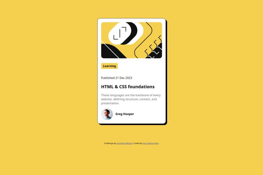
I faced a little challenge in the side of coding the profile picture and the name to float next to each other. So I used flexbox and set a width for the flex container.
Community feedback
- @AustinjnrPosted 5 months ago
Use Semantic Tags, Replace generic <div> elements with more appropriate semantic tags like <section> or <main>. This improves accessibility and readability.
Wrap the main content in a <section> instead of a <div class="container">.
0
Please log in to post a comment
Log in with GitHubJoin our Discord community
Join thousands of Frontend Mentor community members taking the challenges, sharing resources, helping each other, and chatting about all things front-end!
Join our Discord
