Not Found
Not Found
Not Found
Not Found
Not Found
Not Found
Not Found
Not Found
Not Found
Not Found
Not Found
Not Found
Not Found
Not Found
Not Found
Not Found
Not Found
Not Found
Not Found
Not Found

Submitted

Blog Preview Card using HTML and CSS

@Ryan-OHanlon

Desktop design screenshot for the Blog preview card coding challenge

This is a solution for...

  • HTML
  • CSS
1newbie
View challenge

Design comparison


SolutionDesign

Solution retrospective


What are you most proud of, and what would you do differently next time?

I'm most proud of learning how to nest div elements and use the attribute padding to create boxes to contain text elements.

I'm also proud of starting to use flex to align images and text elements.

If I could do something different, I'd like to figure out if there is a better solution to add a consistent margin instead of having to set a margin and padding to each element using a class.

What challenges did you encounter, and how did you overcome them?

My main challenge was figuring out how to use margin and padding to create a webpage to have responsive design between desktop and mobile.

I was able to overcome this by using the main element as the box and then use each div element as their own box for the image and text elements and setting each their own class in CSS. This made spacing out each element a lot easier than having everything in a single div element.

What specific areas of your project would you like help with?

The area of the project I would like help with is how to better understand the position: absolute attribute and the display attribute.

I've yet to come across a decent CSS guide on best practices on how to properly place each element using CSS because the position attribute also being reliant on top, left, and transform seems like a suboptimal solution in order for the element like a card to be in the middle of a webpage.

I'd also like to learn how to get the text to match the font to the solution. I followed the styleguide.md yet the font they want doesn't match the font-weight that they recommend. Should I be using something else besides and ?

Community feedback

P
beowulf1958 1,170

@beowulf1958

Posted

Congratulations on completing the challenge. It is responsive, the hover effect works, and your code is well documented. I do have two suggestions.

First, move the attribution styles out of the head. They belong in the styles.css with the rest of the styles. Having styles in more than one place can make the page harder to maintain.

Second, although your position: absolute; top: 50%; left: 50%; transform: translate(-50%, -50%); works, there is another way using flex. Try this:

      body {
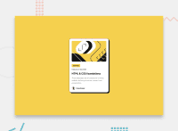
        background-color: hsl(47, 88%, 63%);
        display: flex;
        flex-direction: column;
        align-items: center;
        justify-content: center;
        min-height: 100vh;
      }

Hope this helps.

Marked as helpful

1

@Ryan-OHanlon

Posted

@beowulf1958 Thank you for the feedback. I really appreciate it as I am still trying to figure out how to place elements in certain places on a webpage and being bombarded with so many different solutions makes it confusing which is the actual best practice and which attributes should I learn.

EDIT: I left the attribution style alone since the project code in the index.html file came that way. I'll be sure to adjust it in future projects.

0
CHAmarco 10

@CHAmarco

Posted

use tag: article, picture for images....

0

Please log in to post a comment

Log in with GitHub
Discord logo

Join our Discord community

Join thousands of Frontend Mentor community members taking the challenges, sharing resources, helping each other, and chatting about all things front-end!

Join our Discord