Design comparison
Community feedback
- @JacksonRuddPosted 6 months ago
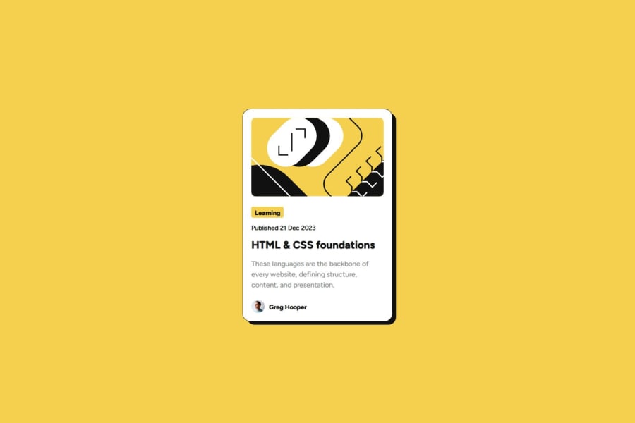
In this solution it looks like you don't have enough space below Gregs signature. Everything else looks spot on.
Marked as helpful1@Toye-devPosted 6 months ago@JacksonRudd
Hi JacksonRudd,
Thank you, I can't figure out what's really going on. Previewing the site shows enough space below Greg's signature. Its just not showing on the screenshot. If I decide to increase the space, It'll probably become excessive on the site. So, I'm a little confused on what to do.
0
Please log in to post a comment
Log in with GitHubJoin our Discord community
Join thousands of Frontend Mentor community members taking the challenges, sharing resources, helping each other, and chatting about all things front-end!
Join our Discord
