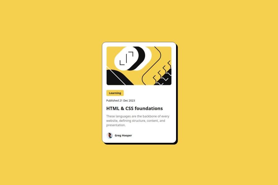
Design comparison
Solution retrospective
In this second project, I used a wider variety of flex display declarations. Another interesting point is that the challenge required a link that changed color when hovering, but I took the liberty of adding other links, as I felt it would be more standardized with what is used in a real-world project.
What challenges did you encounter, and how did you overcome them?Turning certain elements into links was somewhat challenging because the tag behaves differently when positioning it with flex.
What specific areas of your project would you like help with?I tried to be as concise as possible to avoid making the code repetitive. I'm not sure yet, but I believe that in the future, when I am more experienced, I will be able to create the same project in a more efficient way.
Community feedback
- @MarGuc1Posted about 2 months ago
If you want to get rid of repetition in your code I would encourage you to use variables. If that's not enough for you I would try Sass
Hope it helps 💗
Well done and keep it up 😊
Marked as helpful1
Please log in to post a comment
Log in with GitHubJoin our Discord community
Join thousands of Frontend Mentor community members taking the challenges, sharing resources, helping each other, and chatting about all things front-end!
Join our Discord
