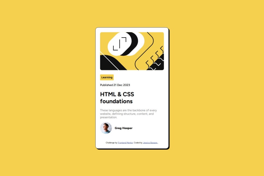
Design comparison
Solution retrospective
I am proud of being able to write the whole code by myself for the first time. I will take time to research more about things I'm not familiar with before beginning the project next time.
What challenges did you encounter, and how did you overcome them?There were properties I didn't know and it was my first time inserting a SVG file. I came across hsl for the first time as well. I googled and used MDN docs and W3 schools to find answers to things I didn't know. I also had a bit of trouble centering the box and making it responsive. I believe my main focus was my solution to look identical to the result however there's room for improvement so I'm ready to try more projects.
What specific areas of your project would you like help with?I need help with CSS positioning or putting a div in the exact position I want it to be. I would also appreciate any feedback as well. As a self-taught individual aspiring to be a web developer, I can use all the resources and feedback I can get to help me do better.
Community feedback
Please log in to post a comment
Log in with GitHubJoin our Discord community
Join thousands of Frontend Mentor community members taking the challenges, sharing resources, helping each other, and chatting about all things front-end!
Join our Discord
