Design comparison
Community feedback
- @Ibtehaj-Ali-1Posted 9 months ago
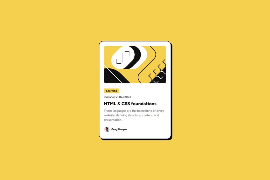
Overall, the Design is perfect, adjust the spacing between paragraph and heading. And the use of that hover effect is looking amazing.
1@faekhatamiPosted 9 months agothank you for your comment 🙋🏻♀️ i will consider them in my next practices! 🌸@Ibtehaj-Ali-1
0 - @FahithKRMPosted 9 months ago
Great work on this solution! For future reference, please remember:
-
Design Specifications: The design files specify the border radius that should be used. Make sure to refer to these specifications.
-
Padding, Margin and Box Sizing: You can apply overall padding inside the main container to create appropriate spacing. Be double the design task.
1@faekhatamiPosted 9 months agothank you for your comment i will consider them in my next practices! 🙋🏻♀️🌸 @FahithKRM
1 -
Please log in to post a comment
Log in with GitHubJoin our Discord community
Join thousands of Frontend Mentor community members taking the challenges, sharing resources, helping each other, and chatting about all things front-end!
Join our Discord
