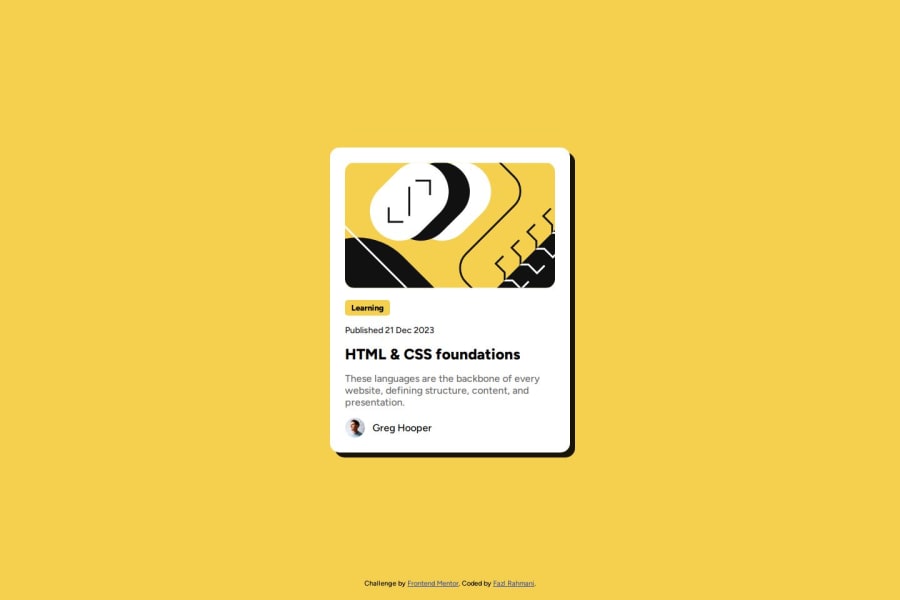
Design comparison
SolutionDesign
Solution retrospective
What are you most proud of, and what would you do differently next time?
I could write more DRY code. tried to use variables for colors
What challenges did you encounter, and how did you overcome them?With Github and git I am still struggling a bit. It was a bit confusing for deploying using github.
What specific areas of your project would you like help with?This one was easy.
Community feedback
- @dylan-dot-cPosted 4 months ago
Hey well done on this solution bro but yiu have a few things to improve on...
- Semantic Html: I think you overused
divshere a bit, so instead you should usemainelement, along withpfor the text, section or article for the card. You can also put your attribution in afootertag. - For Responsiveness, something is off but its not perfectly centered in the middle on mobile devices. It seems to be the margin that you have there so try to remove it and you should be good.
FOr more insights, you can take a look at my code and see how it compares to yours.
All the best! Take care!
Marked as helpful0 - Semantic Html: I think you overused
Please log in to post a comment
Log in with GitHubJoin our Discord community
Join thousands of Frontend Mentor community members taking the challenges, sharing resources, helping each other, and chatting about all things front-end!
Join our Discord
