Not Found
Not Found
Not Found
Not Found
Not Found
Not Found
Not Found
Not Found
Not Found
Not Found
Not Found
Not Found
Not Found
Not Found
Not Found
Not Found
Not Found
Not Found
Not Found
Not Found

Submitted

Blog preview card using html and css

razanabbas 100

@razanabbas

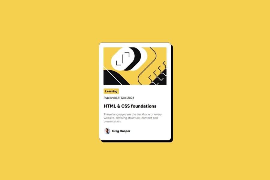
Desktop design screenshot for the Blog preview card coding challenge

This is a solution for...

  • HTML
  • CSS
1newbie
View challenge

Design comparison


SolutionDesign

Solution retrospective


What are you most proud of, and what would you do differently next time?

I am proud that i could solve it quicker than my previous project.

What challenges did you encounter, and how did you overcome them?

This is my first time dealing with an svg so I was not very familiar with them.

What specific areas of your project would you like help with?

I want tips on how to make it more semantic and accessible.

Community feedback

T

@gmagnenat

Posted

Hi congrats on completing the challenge!

I noticed a few things here that you can use to improve this solution and your future challenges.

Does the solution include semantic HTML?

  • a <main> landmark is missing. The main element represents the main content of the body of a document or application. -w3c
  • The image is missing an alt. It is a blog preview and I think this image is meaningful.
  • you can try the <time> element and datetime attribute for the published date.
  • the avatar should have a more meaningful name.

Is it accessible, and what improvements could be made?

  • Currently the layout breakes in case of a reflow test. It isn't accessible for users who change the default font-size of their browser. You need to use relative units for everything related to fonts and sizes. Don't add a height to the card, you want the card to stretch correctly with the content if the size of the content increases. Why font-size must NEVER be in pixels
  • You should add hover and focus style to indicate the interaction and the link. The active state is only visible when the link is pressed.

Does the layout look good on a range of screen sizes?

  • yep

Is the code well-structured, readable, and reusable?

  • you should use a modern CSS reset at the beginning of your stylesheet in every of your projects. Check out Andy Bell and Josh Comeau, both are great.
  • The CSS is hard to read. You should use one of the linter suggested here Set up your dev environment
  • Try to focus on the lowest specificity in your CSS and only increase specificity when needed. You will avoid complexity targetting elements on larger project and your code will be easier to understand and debug by other developers.

Does the solution differ considerably from the design? It looks good and respects the design intention.

I hope you find something useful in these comments. Let me know on discord if you have any questions.

Happy coding !

Marked as helpful

1

Please log in to post a comment

Log in with GitHub
Discord logo

Join our Discord community

Join thousands of Frontend Mentor community members taking the challenges, sharing resources, helping each other, and chatting about all things front-end!

Join our Discord