Design comparison
SolutionDesign
Community feedback
- @zekeer21Posted 5 months ago
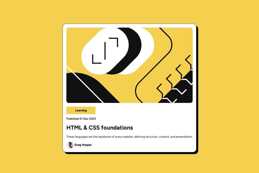
Your solution is pretty nice but I suggest you use a max-width and height in your card so that it won't grow much wide than the expected output. The font sizes should be referred to the figma design to get the exact measures.
Marked as helpful1 - @miaxocPosted 5 months ago
Nice code! Small difference from the original design in the proportions of the card
2
Please log in to post a comment
Log in with GitHubJoin our Discord community
Join thousands of Frontend Mentor community members taking the challenges, sharing resources, helping each other, and chatting about all things front-end!
Join our Discord
