Design comparison
Community feedback
- @AdrianoEscarabotePosted 4 months ago
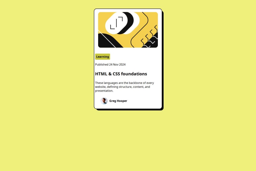
Hey Mintesinot Atnafu, how’s it going? I was really impressed with your project’s result, though I have some advice that could be helpful:
Using Flexbox or Grid on the
bodyto center elements ensures a more responsive and adaptive layout, fitting different screen sizes seamlessly. It avoids manual calculations and constant adjustments needed withmargin,padding, or absolute positioning. These techniques provide more consistent alignment and simplify the code.flexbox:
body {
    display: flex;
    justify-content: center;
    align-items:  center;
    min-height: 100vh;
}
grid:
body {
    display: grid;
    place-content: center;
    min-height: 100vh;
}
Everything else looks great.
Hope this helps! 👍
Marked as helpful0@minte-atnafuPosted 4 months ago@AdrianoEscarabote thank you i think you give some hints on the body
1 - P@jdillard2532Posted 4 months ago
Looks great but the background color appears to be different. You should also center your image. Great Work!
0
Please log in to post a comment
Log in with GitHubJoin our Discord community
Join thousands of Frontend Mentor community members taking the challenges, sharing resources, helping each other, and chatting about all things front-end!
Join our Discord
