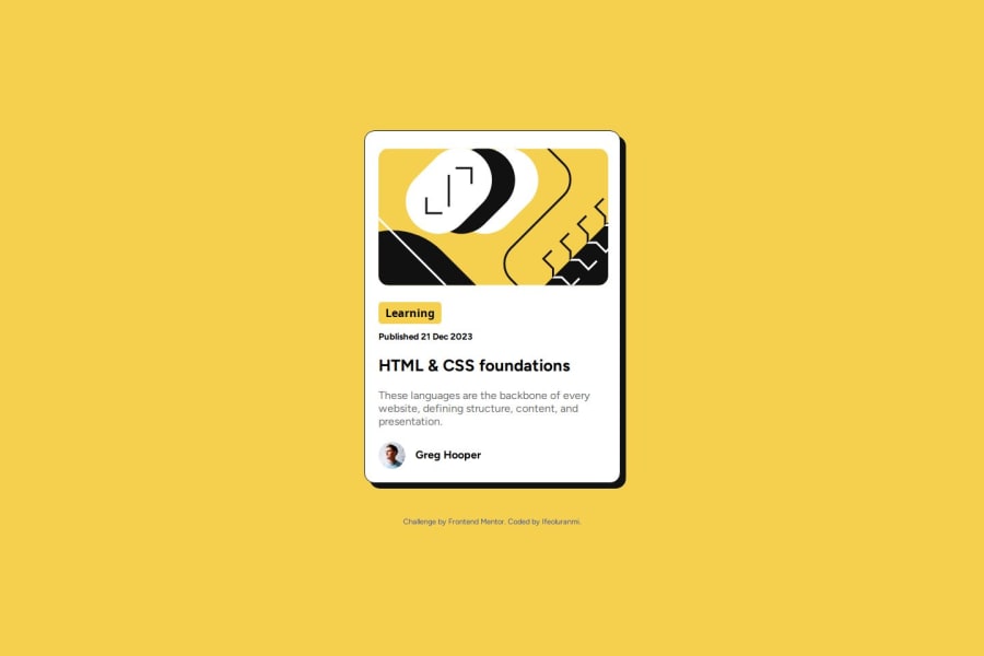
Design comparison
Solution retrospective
it was quite fun while working on this challenge, funny how i know that the card has a black shadow but wasn't sure of how to achieve it. i didn't remember the CSS box shadow property until later time. Another was the "gap" property used with flexbox for aligning items, i used a flex display for the profile name and avatar, and i was confused on how to give space between the two elements, i had used the align and justify property forgetting that the 'gap' property is what is needed for me to achieve the spacing needed.
Community feedback
Please log in to post a comment
Log in with GitHubJoin our Discord community
Join thousands of Frontend Mentor community members taking the challenges, sharing resources, helping each other, and chatting about all things front-end!
Join our Discord

