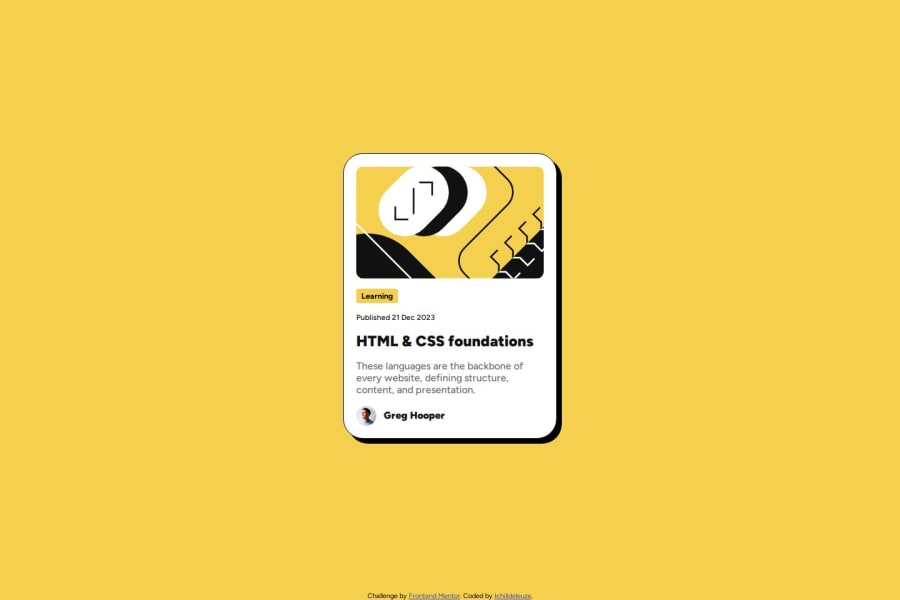


Design comparison

Solution retrospective
I was surprised how quickly I got this done. Practice works!
I'll probably rework this one, once I learned proper responsive design.
What challenges did you encounter, and how did you overcome them?I always trip over the default padding + margin for p, h1, h2, etc.. For the box shadow I used some online generator - will have to take a closer look at how box shadow works for the next challenges, and properly implement it by hand, without help from tools.
Community feedback
- P@sydalwedaiePosted 6 months ago
Hey there!
You have pretty much nailed the design. Well done!
It seems we used the same technique to center the card and have the attribution stuck to the bottom. Though I'm not sure why did you apply flex to both the
htmlandbodytags.To make the font responsive (the extra challenge), consider using the CSS
clamp()function. I learned about it in this very challenge!Box shadow is easy. You only need two figures: one for the horizontal, and one for the vertical offset. The rest all have default values or inherit from the parent. For this project, the following line did it:
box-shadow: 8px 8px;Be careful using those online generators. In your case, it created unnecessary flags (
-webkit, etc). They were used when box-shadow was still in beta. Nowadays it's pretty much supported everywhere.Way to go. Keep it up.
Marked as helpful1

Please log in to post a comment
Log in with GitHubJoin our Discord community
Join thousands of Frontend Mentor community members taking the challenges, sharing resources, helping each other, and chatting about all things front-end!
Join our Discord