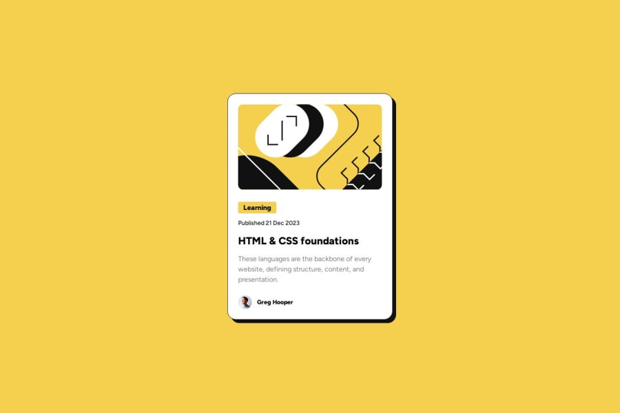
Not Found
Not Found
Not Found
Not Found
Not Found
Not Found
Not Found
Not Found
Not Found
Not Found
Not Found
Not Found
Not Found
Not Found
Not Found
Not Found
Not Found
Not Found
Not Found
Not Found

Submitted

Blog Preview Card using Flexbox

Ashap Bappyā€¢ 50

@ashap-bappy

Desktop design screenshot for the Blog preview card coding challenge

This is a solution for...

  • HTML
  • CSS
1newbie
View challenge

Design comparison


SolutionDesign

Solution retrospective


What are you most proud of, and what would you do differently next time?

I'm most proud of me trying to make a pixel perfect design using various font-styles. I would use PerfectPixel chrome extension next time to make it faster.

What challenges did you encounter, and how did you overcome them?

The challenge that I encounter was making those text as close as possible to the given challenge. I used lots of trial and error to overcome them.

What specific areas of your project would you like help with?

I would like help with how can I efficiently style text so that it looks exactly like the design. I was struggling with the letter-spacing property. Is there any other way I can make the text as close as possible to the challenge.

Community feedback

Daniel šŸ›øā€¢ 44,230

@danielmrz-dev

Posted

Hello there!

Congrats on completing the challenge! āœ…

Your solution is really impressive!

I've got a couple of ideas (about how to use HTML better) that could make it even stronger:

šŸ“Œ First: Think about using <main> to wrap your main content instead of <div>.

Imagine <div> and <span> in HTML as basic containers. They're good for holding stuff, but they don't tell us much about what's inside or its purpose on the webpage.

šŸ“Œ Second: Consider employing <h1> to <h6> tags for headings rather than using <p>.

The <p> tag is primarily intended for paragraphs. When it comes to headings, HTML offers us a range of heading tags: from <h1> to <h6>.

Here's a quick guide on how to use them:

  • The <h1> to <h6> tags are used to define HTML headings.
  • <h1> is for the most important heading.
  • <h6> is for the least important heading.
  • Stick to just one <h1> per page ā€“ it should be the main title for the whole page.
  • And don't skip heading levels ā€“ start with <h1>, then use <h2>, and so on.

It's more than just text size ā€” it's about structuring your content effectively.

These tweaks might not change how your page looks, but they'll make your HTML code clearer and help with SEO and accessibility.

Hope that's helpful!

Keep up the great work!

Marked as helpful

1

Ashap Bappyā€¢ 50

@ashap-bappy

Posted

Hi, @danielmrz-dev

Thanks for your valuable feedback. I will adjust my HTML according to your suggestion.

One more thing to clarify, when I slide the Solution-Design slider, my Solution is looking smaller than the Design given.

Can you give me some suggestion on how can I make it the same size?

1
Daniel šŸ›øā€¢ 44,230

@danielmrz-dev

Posted

@ashap-bappy

If I'm not mistaken, this project comes with a figma design file, where you can find the exact measures of the card.

Or you can use a browser extension called Perfect pixel, which might help you the same way.

Marked as helpful

1
Ashap Bappyā€¢ 50

@ashap-bappy

Posted

@danielmrz-dev

I've updated the solution with the help of your suggestions. I also changed the approach of my CSS implementation. This time It was lot easier to implement. Would you please review my solution and give some feedback on where I can improve further?

0

Please log in to post a comment

Log in with GitHub
Discord logo

Join our Discord community

Join thousands of Frontend Mentor community members taking the challenges, sharing resources, helping each other, and chatting about all things front-end!

Join our Discord