

Design comparison

Solution retrospective
I am proud of the fact that I used some of the skills which I have learned in the previous challenge.
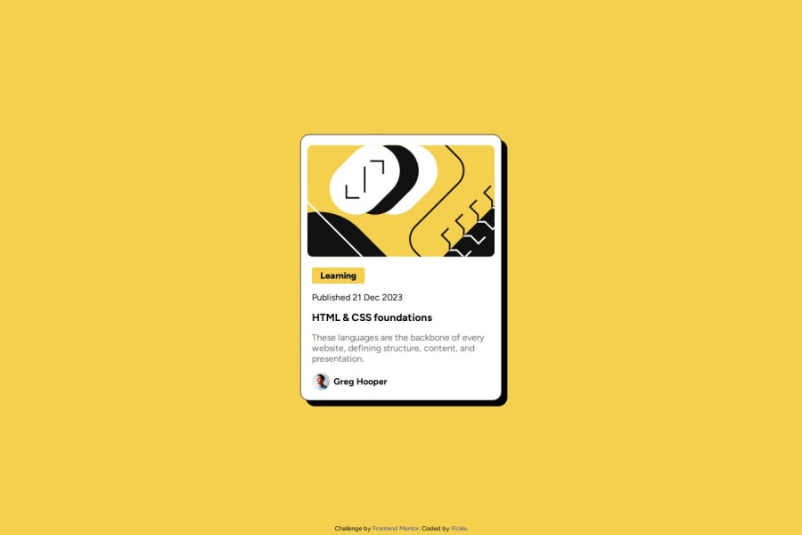
What challenges did you encounter, and how did you overcome them?I found it hard to place the items of the "author". With some creative thinking I used my current knowledge to place the items like the example.
What specific areas of your project would you like help with?As I compare my code to other students, I see that I use too much code. I am open to learn how to shrink my CSS code and learn "DRY" to make it more efficient.
Next to that I had a hard time to place the author elements correctly.
Community feedback
- @beowulf1958Posted 7 months ago
Great job on this project! Looks great in desktop and mobile versions. I do have a suggestion; the card needs a hover state where the title turns yellow. Also, the hover on the footer is so subtle I can't even see it change; use a contrasting color like pink to make it stand out.
When it comes to DRY code, the key is to pull out anything repeated and create a utility class. For example, both your body and .container similar flex properties. Create a class:
.flex-col {
  display: flex;
  flex-direction: column;
  align-items: center;
  justify-content: center;
}
Now you add the utility class to the body tag, as well as the container div. You just saved yourself 4 lines of code! Also, eliminate unnecessary code: flexbox is direction "row" by default, so no need to declare it unless you are changing the flex-direction back to row from column.
Lastly, DRY code does the most impactful styles first. So, instead of all the margin-top, margin-bottom, etc, put some padding on the .container and a flex gap on left-content. I have forked your repo on github if you want to check it all out. Reduces the code almost a third.
Hope this helps! And keep on coding.
Marked as helpful0@Augurk66Posted 7 months ago@beowulf1958
Thank you for your compliments and the feedback, it helped me a lot. I appreciate the fact that you forked the project to show the correct way! I am going to improve the code and move to the next one.
Once again thank you!
0

Please log in to post a comment
Log in with GitHub
Join our Discord community
Join thousands of Frontend Mentor community members taking the challenges, sharing resources, helping each other, and chatting about all things front-end!
Join our Discord